
こんにちは、株式会社Pentagonでアプリ開発をしている山田です。
https://pentagon.tokyo
今回は、登録フォームなどで使われているチェックボックスの作り方についてまとめていきます。
【こんな人に読んで欲しい】
- FlutterでCheckBoxを追加して、Formを作りたい人
- CheckBoxListTileとは別の方法で作成し、カスタマイズしたい人
【この記事を読むメリット】
この記事には、通常使われるCheckBoxListTileの使い方と、CheckBoxをカスタマイズさせるやり方をまとめています。
Flutterを勉強し始めた方に役に立つと思うので、ぜひ読んでみてください。
目次
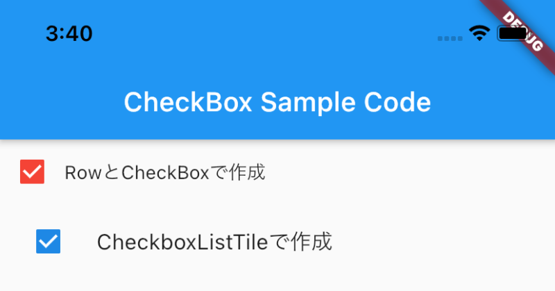
今回作成するサンプル画像

サンプルコード
import 'package:flutter/material.dart';

void main() => runApp(const MyApp());

/// This is the main application widget.
class MyApp extends StatelessWidget {
 const MyApp({Key? key}) : super(key: key);

 static const String _title = 'CheckBox Sample Code';

 @override
 Widget build(BuildContext context) {
   return MaterialApp(
     title: _title,
     home: Scaffold(
       appBar: AppBar(title: const Text(_title)),
       body: const Center(
         child: MyStatefulWidget(),
       ),
     ),
   );
 }
}

class MyStatefulWidget extends StatefulWidget {
 const MyStatefulWidget({Key? key}) : super(key: key);

 @override
 State<MyStatefulWidget> createState() => _MyStatefulWidgetState();
}

class _MyStatefulWidgetState extends State<MyStatefulWidget> {
 bool isChecked = false;
 bool isSelected = false;
 @override
 Widget build(BuildContext context) {
   return Column(
     children: [
       _rowCheckBox(),
       _checkBoxListTile(),
     ],
   );
 }

 Widget _rowCheckBox() {
   Color getColor(Set<MaterialState> states) {
     const Set<MaterialState> interactiveStates = <MaterialState>{
       MaterialState.pressed,
       MaterialState.hovered,
       MaterialState.focused,
     };
     if (states.any(interactiveStates.contains)) {
       return Colors.blue;
     }
     return Colors.red;
   }

   return Row(
     children: [
       Checkbox(
         checkColor: Colors.white,
         fillColor: MaterialStateProperty.resolveWith(getColor),
         value: isChecked,
         onChanged: (bool? value) {
           setState(() {
             isChecked = value!;
           });
         },
       ),
       Flexible(
         child: Text(
           'RowとCheckBoxで作成',
         ),
       ),
     ],
   );
 }

 Widget _checkBoxListTile() {
   return CheckboxListTile(
     title: const Text('CheckboxListTileで作成'),
     value: isSelected,
     controlAffinity: ListTileControlAffinity.leading,
     onChanged: (value) {
       setState(() {
         isSelected = value!;
       });
     },
   );
 }
}
CheckBoxの作り方の解説
今回のサンプルコードには、CheckBoxクラスを用いたCheckBoxとCheckBoxListTileを用いたCheckBoxを用意しました。
上部のCheckBoxがCheckBoxクラスを用いたもので、下部がCheckBixLustTileを用いたものです。
それぞれの違いですが、基本的にCheckBoxListが自動的に綺麗にリストを作ることができます。
また、それぞれデザインのカスタマイズが可能です。
以下が公式のドキュメントになります。
CheckBox Class
CheckBoxListTile
Q. チェックボックスとTextの空白を取り除きたい場合
この場合は、CheckBoxListTileよりも、CheckBoxクラスを使った方が良いです。
例えば次の様なコードを使うと、以下の画像の様になります。
Container(
 margin: const EdgeInsets.symmetric(horizontal: 6),
 width: 16,
 height: 16,
 child: Checkbox(
   checkColor: Colors.white,
   fillColor: MaterialStateProperty.resolveWith(getColor),
   value: isChecked,
   onChanged: (bool? value) {
     setState(() {
       isChecked = value!;
     });
   },
 ),
),
まとめ
いかがだったでしょうか?
基本的には、CheckBoxListTileで作成して良いと思います。
しかし、複雑なデザインの場合は、CheckBoxで対応しましょう。