
こんにちは、株式会社Pentagonでアプリ開発をしている山田です。
今回は、Flutterの「sliding_up_panel」というパッケージの使い方を解説します。
sliding_up_panelを利用すると、スクロールして下からせり上がってくるようなUIを簡単に実装できます。
GoogleマップのようなUIを実装したい方に、ぴったりのパッケージです!
【こんな人に読んで欲しい】
・これから sliding_up_panelのパッケージを使いたい方
・GoogleマップのようなUIを簡単に実装したい方
【この記事を読むメリット】
・sliding_up_panelのパッケージの使い方や設定方法が分かります。
【結論】
sliding_up_panelのパッケージを用いると、スクロールして下からせり上がってくるUIを簡単に実装できます。
sliding_up_panel パッケージとは?
以下がパッケージのリンクです。
https://pub.dev/packages/sliding_up_panel
このパッケージは、ドラッグ可能なパネルの実装を行ってくれるパッケージとなっています。
マテリアルデザインの、ボトムシートコンポーネントをベースにしたWidgetです。

今回作成するサンプル画像
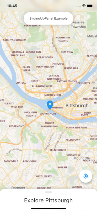
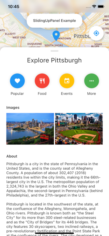
こちらのスライドアップされているものは、スクロールできます。
作成したサンプルアプリの全体のコード
以下が今回作成したサンプルアプリの全体のコードです。
import 'dart:ui';

import 'package:cached_network_image/cached_network_image.dart';
import 'package:flutter/material.dart';
import 'package:flutter/services.dart';
import 'package:flutter_map/flutter_map.dart';
import 'package:latlong2/latlong.dart';
import 'package:sliding_up_panel/sliding_up_panel.dart';

void main() => runApp(SlidingUpPanelExample());

class SlidingUpPanelExample extends StatelessWidget {
 @override
 Widget build(BuildContext context) {
   SystemChrome.setSystemUIOverlayStyle(SystemUiOverlayStyle(
     systemNavigationBarColor: Colors.grey[200],
     systemNavigationBarIconBrightness: Brightness.dark,
     systemNavigationBarDividerColor: Colors.black,
   ));

   return MaterialApp(
     debugShowCheckedModeBanner: false,
     title: 'SlidingUpPanel Example',
     theme: ThemeData(
       primarySwatch: Colors.blue,
     ),
     home: HomePage(),
   );
 }
}

class HomePage extends StatefulWidget {
 @override
 _HomePageState createState() => _HomePageState();
}

class _HomePageState extends State<HomePage> {
 final double _initFabHeight = 120.0;
 double _fabHeight = 0;
 double _panelHeightOpen = 0;
 double _panelHeightClosed = 95.0;

 @override
 void initState() {
   super.initState();

   _fabHeight = _initFabHeight;
 }

 @override
 Widget build(BuildContext context) {
   _panelHeightOpen = MediaQuery.of(context).size.height * .80;

   return Material(
     child: Stack(
       alignment: Alignment.topCenter,
       children: <Widget>[
         SlidingUpPanel(
           maxHeight: _panelHeightOpen,
           minHeight: _panelHeightClosed,
           parallaxEnabled: true,
           parallaxOffset: .5,
           body: _body(),
           panelBuilder: (sc) => _panel(sc),
           borderRadius: BorderRadius.only(
               topLeft: Radius.circular(18.0),
               topRight: Radius.circular(18.0)),
           onPanelSlide: (double pos) => setState(() {
             _fabHeight = pos * (_panelHeightOpen - _panelHeightClosed) +
                 _initFabHeight;
           }),
         ),

         // the fab
         Positioned(
           right: 20.0,
           bottom: _fabHeight,
           child: FloatingActionButton(
             child: Icon(
               Icons.gps_fixed,
               color: Theme.of(context).primaryColor,
             ),
             onPressed: () {},
             backgroundColor: Colors.white,
           ),
         ),

         Positioned(
             top: 0,
             child: ClipRRect(
                 child: BackdropFilter(
                     filter: ImageFilter.blur(sigmaX: 10, sigmaY: 10),
                     child: Container(
                       width: MediaQuery.of(context).size.width,
                       height: MediaQuery.of(context).padding.top,
                       color: Colors.transparent,
                     )))),

         //the SlidingUpPanel Title
         Positioned(
           top: 52.0,
           child: Container(
             padding: const EdgeInsets.fromLTRB(24.0, 18.0, 24.0, 18.0),
             child: Text(
               "SlidingUpPanel Example",
               style: TextStyle(fontWeight: FontWeight.w500),
             ),
             decoration: BoxDecoration(
               color: Colors.white,
               borderRadius: BorderRadius.circular(24.0),
               boxShadow: [
                 BoxShadow(
                     color: Color.fromRGBO(0, 0, 0, .25), blurRadius: 16.0)
               ],
             ),
           ),
         ),
       ],
     ),
   );
 }

// パネル側のWidget
 Widget _panel(ScrollController sc) {
   return MediaQuery.removePadding(
       context: context,
       removeTop: true,
       child: ListView(
         controller: sc,
         children: <Widget>[
           SizedBox(
             height: 12.0,
           ),
           Row(
             mainAxisAlignment: MainAxisAlignment.center,
             children: <Widget>[
               Container(
                 width: 30,
                 height: 5,
                 decoration: BoxDecoration(
                     color: Colors.grey[300],
                     borderRadius: BorderRadius.all(Radius.circular(12.0))),
               ),
             ],
           ),
           SizedBox(
             height: 18.0,
           ),
           Row(
             mainAxisAlignment: MainAxisAlignment.center,
             children: <Widget>[
               Text(
                 "Explore Pittsburgh",
                 style: TextStyle(
                   fontWeight: FontWeight.normal,
                   fontSize: 24.0,
                 ),
               ),
             ],
           ),
           SizedBox(
             height: 36.0,
           ),
           Row(
             mainAxisAlignment: MainAxisAlignment.spaceEvenly,
             children: <Widget>[
               _button("Popular", Icons.favorite, Colors.blue),
               _button("Food", Icons.restaurant, Colors.red),
               _button("Events", Icons.event, Colors.amber),
               _button("More", Icons.more_horiz, Colors.green),
             ],
           ),
           SizedBox(
             height: 36.0,
           ),
           Container(
             padding: const EdgeInsets.only(left: 24.0, right: 24.0),
             child: Column(
               crossAxisAlignment: CrossAxisAlignment.start,
               children: <Widget>[
                 Text("Images",
                     style: TextStyle(
                       fontWeight: FontWeight.w600,
                     )),
                 SizedBox(
                   height: 12.0,
                 ),
                 Row(
                   mainAxisAlignment: MainAxisAlignment.spaceBetween,
                   children: <Widget>[
                     CachedNetworkImage(
                       imageUrl:
                           "https://images.fineartamerica.com/images-medium-large-5/new-pittsburgh-emmanuel-panagiotakis.jpg",
                       height: 120.0,
                       width: (MediaQuery.of(context).size.width - 48) / 2 - 2,
                       fit: BoxFit.cover,
                     ),
                     CachedNetworkImage(
                       imageUrl:
                           "https://cdn.pixabay.com/photo/2016/08/11/23/48/pnc-park-1587285_1280.jpg",
                       width: (MediaQuery.of(context).size.width - 48) / 2 - 2,
                       height: 120.0,
                       fit: BoxFit.cover,
                     ),
                   ],
                 ),
               ],
             ),
           ),
           SizedBox(
             height: 36.0,
           ),
           Container(
             padding: const EdgeInsets.only(left: 24.0, right: 24.0),
             child: Column(
               crossAxisAlignment: CrossAxisAlignment.start,
               children: <Widget>[
                 Text("About",
                     style: TextStyle(
                       fontWeight: FontWeight.w600,
                     )),
                 SizedBox(
                   height: 12.0,
                 ),
                 Text(
                   """(中略) """,
                   softWrap: true,
                 ),
               ],
             ),
           ),
           SizedBox(
             height: 24,
           ),
         ],
       ));
 }

 Widget _button(String label, IconData icon, Color color) {
   return Column(
     children: <Widget>[
       Container(
         padding: const EdgeInsets.all(16.0),
         child: Icon(
           icon,
           color: Colors.white,
         ),
         decoration:
             BoxDecoration(color: color, shape: BoxShape.circle, boxShadow: [
           BoxShadow(
             color: Color.fromRGBO(0, 0, 0, 0.15),
             blurRadius: 8.0,
           )
         ]),
       ),
       SizedBox(
         height: 12.0,
       ),
       Text(label),
     ],
   );
 }

// パネル裏のマップを表示するWidget
 Widget _body() {
   return FlutterMap(
     options: MapOptions(
       center: LatLng(40.441589, -80.010948),
       zoom: 13,
       maxZoom: 15,
     ),
     layers: [
       TileLayerOptions(
           urlTemplate: "https://maps.wikimedia.org/osm-intl/{z}/{x}/{y}.png"),
       MarkerLayerOptions(markers: [
         Marker(
             point: LatLng(40.441753, -80.011476),
             builder: (ctx) => Icon(
                   Icons.location_on,
                   color: Colors.blue,
                   size: 48.0,
                 ),
             height: 60),
       ]),
     ],
   );
 }
}
作成したサンプルアプリのコード解説
このソースコードは、sliding_up_panelのサンプルコードを元にしております。
基本構造
このスライドアップできるパネルに関しては、以下のSlidingUpPanel()で実装しています。
以下、各パラメータの説明です。
SlidingUpPanel(
 maxHeight: _panelHeightOpen,
 minHeight: _panelHeightClosed,
 parallaxEnabled: true,
 parallaxOffset: .5,
 body: _body(),
 panelBuilder: (sc) => _panel(sc),
 borderRadius: BorderRadius.only(
     topLeft: Radius.circular(18.0),
     topRight: Radius.circular(18.0)),
 onPanelSlide: (double pos) => setState(() {
   _fabHeight = pos * (_panelHeightOpen - _panelHeightClosed) +
       _initFabHeight;
 }),
),
masHeight: パネルをどの位置まで上げれるかを指定します。
ここでは、画面全体から0.8ポイント下げたところまでしか上げられない仕様です
minHeight: パネルをどの位置まで下げられるかを指定します。0にすると、パネルが全て隠れますので、今回は95.0ポイント残るような設定です。
parallaxEnabled: デフォルトでは trueになっていますが、falseにすると、後ろのスクリーンにparallaxのエフェクトがかからない様にできます。
parallaxOffset: 0.0~1.0までの数値でparallaxの移動範囲を指定ができます。デフォルトでは0.1の値が指定されています。
Body: パネル下の画面を指定します。ここでは_body()を指定しており、FlutterMapで地図を表示させています。
※. パッケージ側のサンプルではlatlongが使われていましたが、最新のFlutterではlatlong2を使用しないといけません。パッケージ側のサンプルを動かす際は注意して下さい。
panelBuilder: ここにパネル側のWidgetを指定します。ScrollController を渡し、パネル内でもスクロール出来る様な仕様です。
borderRadius: パネル側の境界線を指定可能です。
ここでは丸みをおびさせるために、Radius.circularを指定しています。
onPanelSlide: パネルの現在の位置で呼び出されるパラメータです。0~1.0の間のスライド位置の値が返ってきます。
sliding_up_panelを使用する際に起こった問題の解決方法
body:に画像を設定する場合、png画像ではなく、svg画像で指定することをお勧めします。もしpng画像で指定しなければいけない場合、画像の大きさを元に、maxHeight:とminHeight:を指定して下さい。- SlidingUpPanel 内にpull to refresh を設置し、リロードをする機能をつけたい場合、コンフリクトして、リロード機能が効かなくなる事象があります。解決するためには、リロードボタンを追加するといった対策を取りましょう。
まとめ
いかがでしたでしょうか?詳しいパラメータに関しては、公式ページのReadMeをご確認下さい。