
こんにちは、株式会社Pentagonでアプリ開発をしている山崎です!
この記事では、flutter_screenutilを使用して異なるサイズの端末にデザインを適用する方法について説明します。
flutter_screenutilとは、Widgetを端末のサイズごとに大きさを調整してくれるパッケージとなります。
flutter_screenutilを使用することで異なるサイズの端末のデザイン崩れを防ぐことができます。
【こんな人に読んで欲しい】
- サイズの異なる端末にデザインを適用するのに苦労しているエンジニア
- flutter_screenutilに興味があるエンジニア
【この記事を読むメリット】
- flutter_screenutilの使い方が分かる
- flutter_screenutilを使用した時に異なるサイズの端末ごとのデザインがどのようになるかを知ることができる
【結論】
flutter_screenutilを使用することで、異なるサイズの端末のデザイン崩れを防ぐことができるが、完璧にデザイン崩れを防ぐことはできないため、iPadなどの大きな画面では個別に修正をする必要があります。
しかし、flutter_screenutilを使用することで異なるサイズの端末でのデザイン調整が楽になるので積極的に取り入れても良いかと思います。
この機会にflutter_screenutilを取り入れてみてはいかがでしょうか!
パッケージのインストール
最初に、pubspec.yamlに今回使用するパッケージを入力し、保存します。
dependencies:
  flutter_hooks:
  flutter:
    sdk: flutter
  flutter_screenutil: ^5.9.0
ターミナルに下記のコマンドを入力し、パッケージをインストールします。
flutter pub get
画面の作成
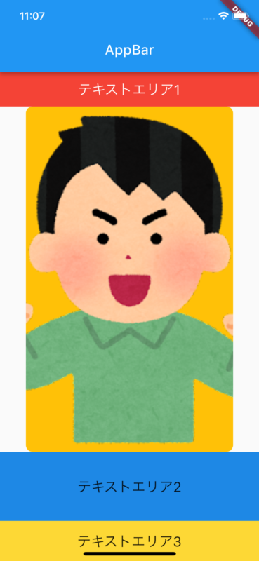
iPhone 13 Proにデザインを適用していきます。
fifth_page.dart
import 'package:flutter/material.dart';
import 'package:flutter_hooks/flutter_hooks.dart';
import 'package:flutter_screenutil/flutter_screenutil.dart';

class FifthPage extends HookWidget {
  const FifthPage({super.key});

  @override
  Widget build(BuildContext context) {
    return Scaffold(
      appBar: PreferredSize(
        preferredSize: Size.fromHeight(60),
        child: AppBar(
          title: Text(
            "AppBar",
            style: TextStyle(fontSize: 20),
          ),
        ),
      ),
      body: Column(
        crossAxisAlignment: CrossAxisAlignment.center,
        children: [
          Container(
            height: 50,
            width: double.infinity,
            color: Colors.red,
            child: Center(
              child: Text(
                'テキストエリア1',
                style: TextStyle(color: Colors.white, fontSize: 20),
              ),
            ),
          ),
          Row(
            children: [
              Spacer(),
              Container(
                width: 300,
                height: 500,
                decoration: BoxDecoration(
                  color: Colors.amber,
                  borderRadius: BorderRadius.circular(10),
                  image: DecorationImage(
                    image: AssetImage('assets/images/sample.png'),
                    fit: BoxFit.cover,
                  ),
                ),
              ),
              Spacer(),
            ],
          ),
          Container(
            height: 100,
            width: double.infinity,
            color: Colors.blue[600],
            child: Center(
                child: Text(
              'テキストエリア2',
              style: TextStyle(fontSize: 20),
            )),
          ),
          Expanded(
            child: Container(
              color: Colors.yellow[600],
              child: Center(
                  child: Text(
                'テキストエリア3',
                style: TextStyle(fontSize: 20),
              )),
            ),
          )
        ],
      ),
    );
  }
}
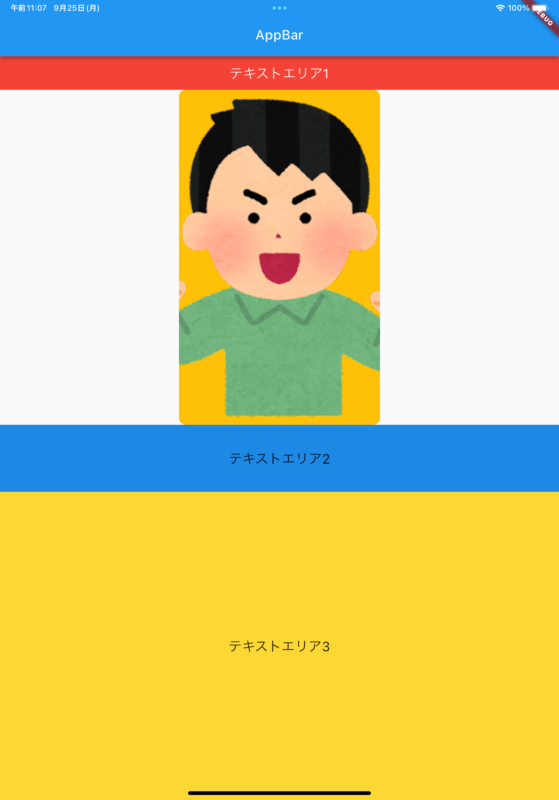
flutter_screenutil適用前の
iPhone 13 Proの画像
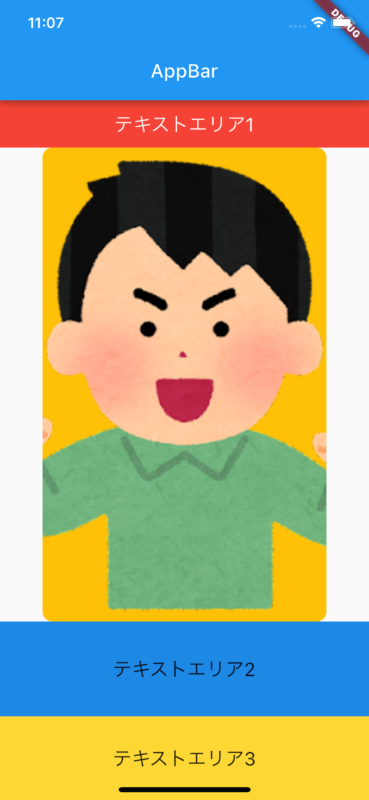
flutter_screenutil適用前の
iPhoneSEの画像
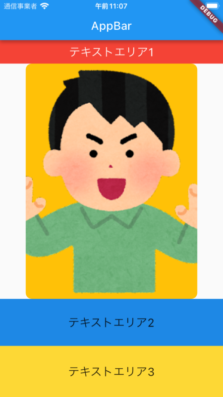
flutter_screenutil適用前の
iPad Pro 11-inchの画像
flutter_screenutilの適用
FifthPageをScreenUtilInitで囲みます。
main.dart
import 'package:flutter/material.dart';
import 'package:flutter_screenutil/flutter_screenutil.dart';
import 'package:hello/Fifth.dart';
void main() {
  return runApp(const MaterialApp(home: MyApp()));
}
class MyApp extends StatelessWidget {
  const MyApp({Key? key}) : super(key: key);
  @override
  Widget build(BuildContext context) {
    // アプリ内で一度だけ設定してください。
    return ScreenUtilInit(
      // ここに基準となるデバイスサイズ(dp)を設定します。
      // 今回はiPhone14Proのサイズを基準にします。
      designSize: const Size(390, 844),
      builder: (_, child) {
        return MaterialApp(
          debugShowCheckedModeBanner: false,
          theme: ThemeData(),
          home: child,
        );
      },
      child: const FifthPage(),
    );
  }
}- Widgetのheightとwidthとフォントサイズを調整するために、heightの値に.hを付け、widthの値に.wを付け、フォントサイズの値に.spを付けます。
import 'package:flutter/material.dart';
import 'package:flutter_hooks/flutter_hooks.dart';
import 'package:flutter_screenutil/flutter_screenutil.dart';

class FifthPage extends HookWidget {
  const FifthPage({super.key});

  @override
  Widget build(BuildContext context) {
    return Scaffold(
      appBar: PreferredSize(
        preferredSize: Size.fromHeight(60.h),
        child: AppBar(
          title: Text(
            "AppBar",
            style: TextStyle(fontSize: 20.sp),
          ),
        ),
      ),
      body: Column(
        crossAxisAlignment: CrossAxisAlignment.center,
        children: [
          Container(
            height: 50.h,
            width: double.infinity.w,
            color: Colors.red,
            child: Center(
              child: Text(
                'テキストエリア1',
                style: TextStyle(color: Colors.white, fontSize: 20.sp),
              ),
            ),
          ),
          Row(
            children: [
              Spacer(),
              Container(
                width: 300.w,
                height: 500.h,
                decoration: BoxDecoration(
                  color: Colors.amber,
                  borderRadius: BorderRadius.circular(10),
                  image: DecorationImage(
                    image: AssetImage('assets/images/sample.png'),
                    fit: BoxFit.cover,
                  ),
                ),
              ),
              Spacer(),
            ],
          ),
          Container(
            height: 100.h,
            width: double.infinity.w,
            color: Colors.blue[600],
            child: Center(
                child: Text(
              'テキストエリア2',
              style: TextStyle(fontSize: 20.sp),
            )),
          ),
          Expanded(
            child: Container(
              color: Colors.yellow[600],
              child: Center(
                  child: Text(
                'テキストエリア3',
                style: TextStyle(fontSize: 20.sp),
              )),
            ),
          )
        ],
      ),
    );
  }
}
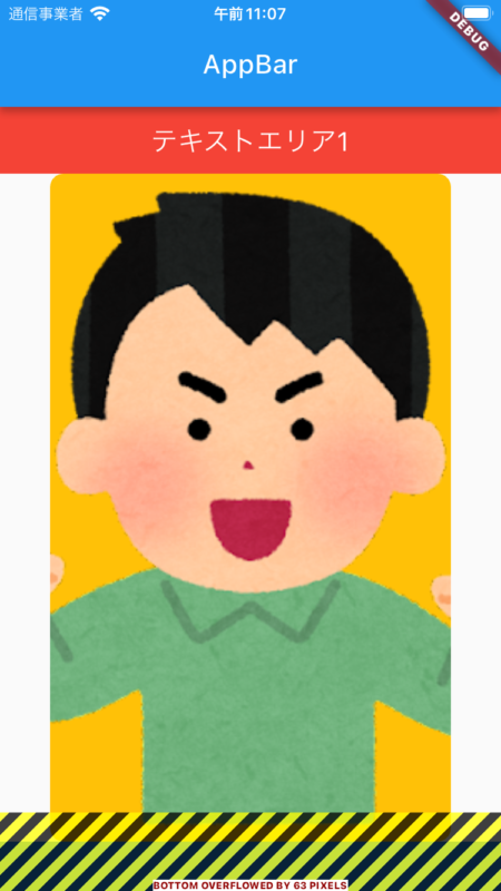
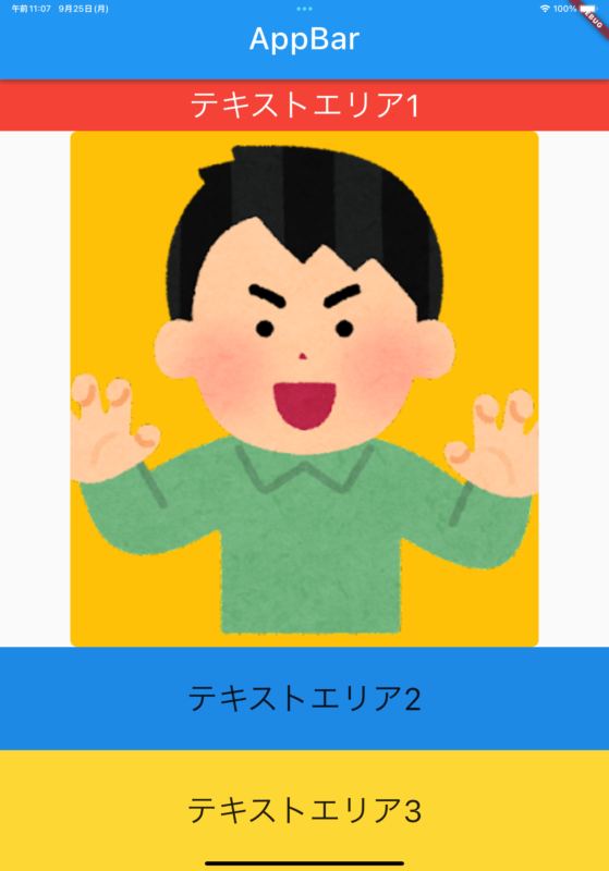
flutter_screenutil適用後の
iPhone 13 Proの画像
flutter_screenutil適用後の
iPhoneSEの画像
flutter_screenutil適用後の
iPad Pro 11-inchの画像
まとめ
flutter_screenutilを使用することで異なるサイズの端末にデザインを調整して適用することができます。
しかし、iPadのAppbarのタイトルの位置など細かい部分は個別に調整する必要があります。
flutter_screenutilを使用することのデメリットよりメリットの方が大きいと思うので、積極的にプロジェクトに取り入れてみてはいかがでしょうか。
おまけ
Flutterに関する知識を深めたい方には、『Flutterの特徴・メリット・デメリットを徹底解説』という記事がおすすめです。
この記事では、Flutter アプリ開発の基本から、flutter とは何か、そして実際のflutter アプリ 事例を通じて、その将来性やメリット、デメリットまで詳しく解説しています。
Flutterを使ったアプリ開発に興味がある方、またはその潜在的な可能性を理解したい方にとって、必見の内容となっています。
ぜひ一度ご覧ください。